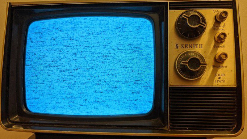
With the huge popularity of retrocomputing and of cyberdecks, we have seen a variety of projects that use a modern computer such as a Raspberry Pi bathed in the glorious glow of a CRT being used as a monitor. The right aesthetic is easily achieved this way, but there’s more to using a CRT display than simply thinking about its resolution. Particularly a black-and-white CRT or a vintage TV has some limitations due to its operation, that call for attention to the design of what is displayed upon it. [Jordan “Ploogle” Carroll] has taken a look at this subject, using a 1975 Zenith portable TV as an example.
The first difference between a flat panel and a CRT is that except in a few cases it has a curved surface and corners, and the edges of the scanned area protrude outside the edges of the screen. Thus the usable display area is less than the total display area, meaning that the action has to be concentrated away from the edges. Then there is the effect of a monochrome display on colour choice, in other words the luminance contrast between adjacent colours must be considered alongside the colour contrast. And finally there’s the restricted bandwidth of a CRT display, particularly when it fed via an RF antenna socket, which affects how much detail it can reasonably convey. The examples used are games, and it’s noticeable how Nintendo’s design language works well with this display. We can’t imagine Nintendo games being tested on black-and-white TV sets in 2022, so perhaps this is indicative of attention paid to design for accessibility.
While they require a bit of respect due to the presence of dangerous voltages, there’s a lot of fun to be had bringing a CRT into 2022. Get one while you still can, and maybe you could have a go at a retro cyberdeck.
Designing For The Small Grey Screen
Source: Manila Flash Report
0 Comments